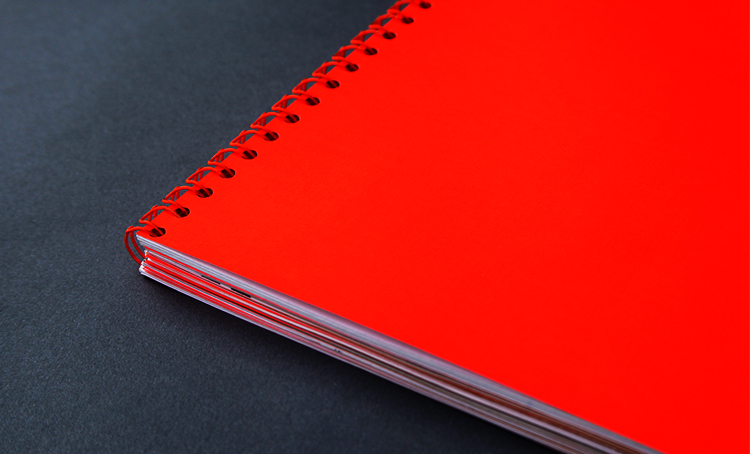
With respect to various anthologies of concrete poetry, a large spiral-bound book was considered an ideal platform for the demonstration of accentuable typographic studies. The colour palette was restricted to two colours—black and Pantone 811C—and a variety of paper stocks provided additional tonal contrast where appropriate.
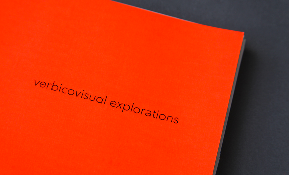
Concrete poet Dom Sylvester Houédard coined the term “verbicovisual” in the first article published on concrete poetry in Britain (in Typographica 7, 1963). It seemed like an appropriate title for this book.
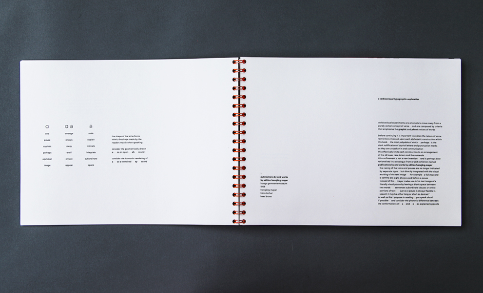
The first twenty pages of the book contain an essay I wrote which rationalised the project, and was presented solely in lower case, using no punctuation marks (we don’t speak them, so why should we print them?).
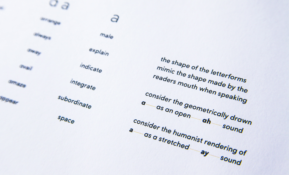
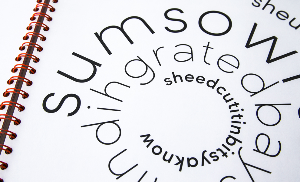
In keeping with the ethos of a variety of prolific concrete poets, I introduced a rule whereby different conformations of letters produce different sounds while reading.
Considering that concrete poems offer the reader multifaceted modes of interpretation, I transcribed sound clips as I heard them, and then translated these into comprehendable English.
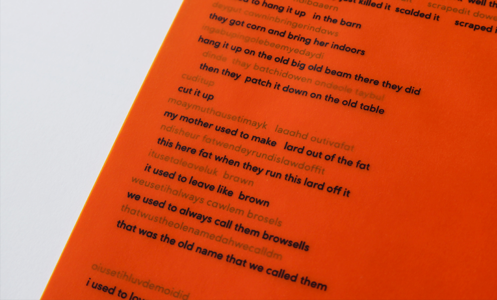
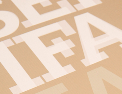
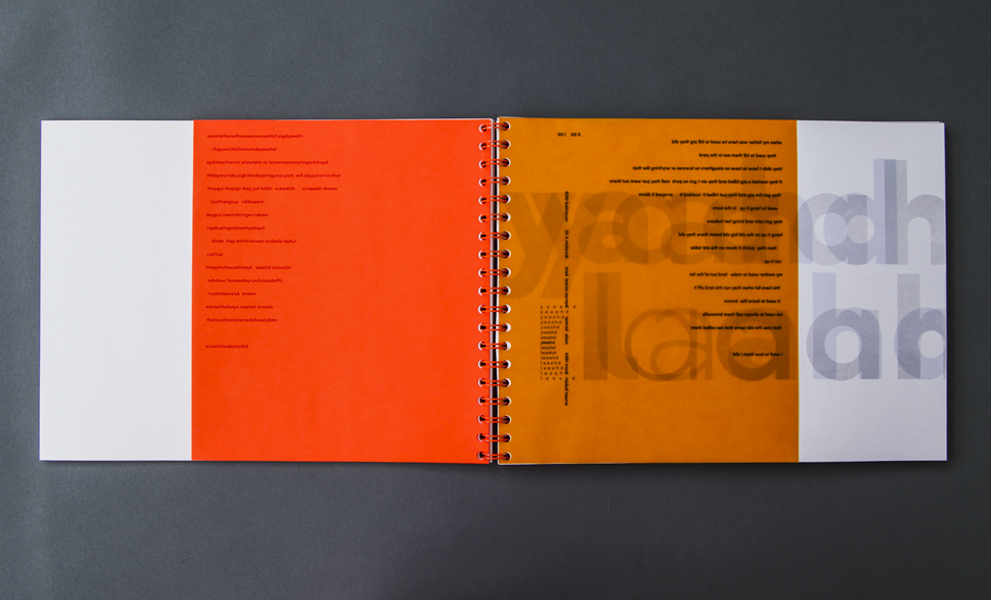
The transcriptions were printed on fluro orange paper, while the translations were printed on orange tracing paper. As the pages are turned, the two texts merge.
The orange pages indicated different speakers and sections, and from the transcriptions I made a series of concrete poems whose forms were determined by the voice of the speaker.
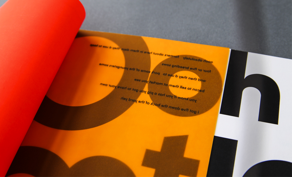
Besides functioning as dividing pages, the orange sheets added to the aesthetic quality of the book, creating unexpected typographic forms.
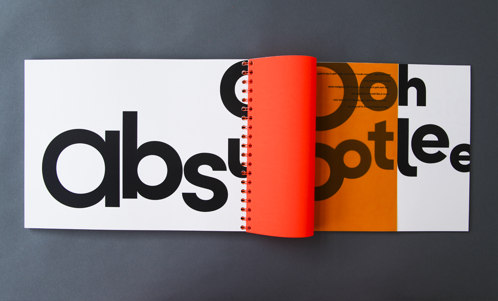
Each poem is unique, and set using only the twenty six lower case letters of Sofia Pro.
Bold, loud voices were given bold, loud typographic treatments, and the book opened flat to allow each spread to be carefully considered with respect to their various dimensions.
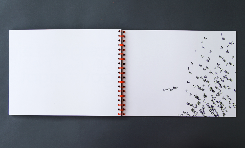
Some voices warranted more experimental presentations. In this spread, the reader makes their own concrete poem using six short, wide sheets, a reflection of the disjointed recording.
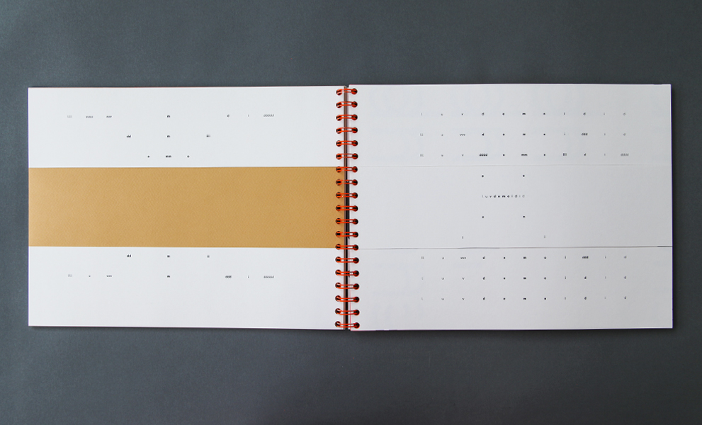
Different weights of Sofia Pro were used in some poems for emphasis.
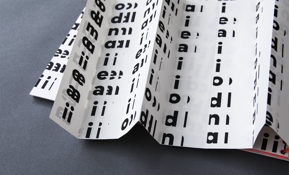
A stretched voice demanded a stretched typographic interpretation. This sheet was wider than the book itself, but could be folded to any size, allowing the reader to create their own poem.