Swiss Typography catalogue

This brief was a 2nd year design student’s dream — I had to transform an essay I had written called “Swiss Typography + the art of the letterform” into a catalogue for a hypothetical exhibition on the topic.

Since first hearing about Josef Müller-Brockmann and Armin Hofmann in first year, my goal was to master the art of typography. A few years on, I’m no master but I do have a solid understanding of the basic principles. This project really helped ground those principles, as it involved hours and hours of drawing, cutting and arranging letters (much to my delight), and a small forest worth of prints and drawings.

The catalogue was printed in a variety of stocks and handbound, using a restricted colour palette (plenty of red, grey and black), a rigid grid and a restrained typographic hierarchy. A display box was also crafted and screen printed. It housed, along with the catalogue, promotional material for the exhibition including three screen printed postcards and a B2 poster.

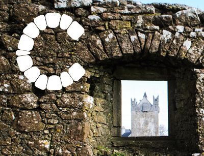
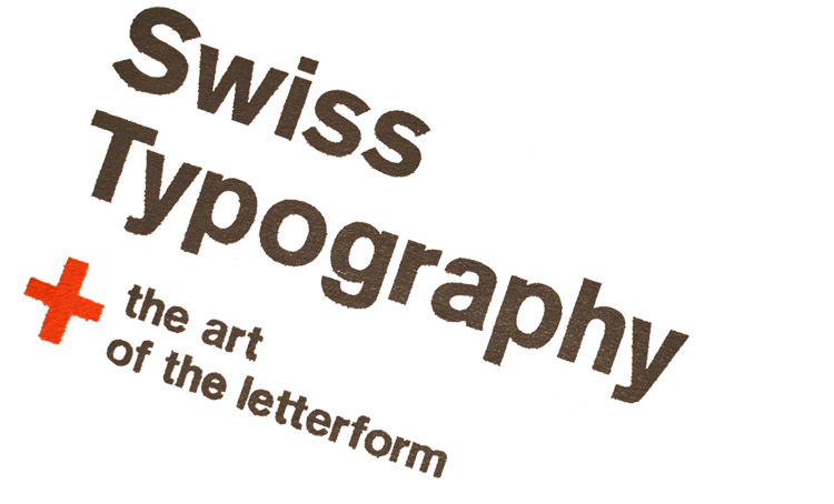
Detail of a two colour screen print I made for this project.

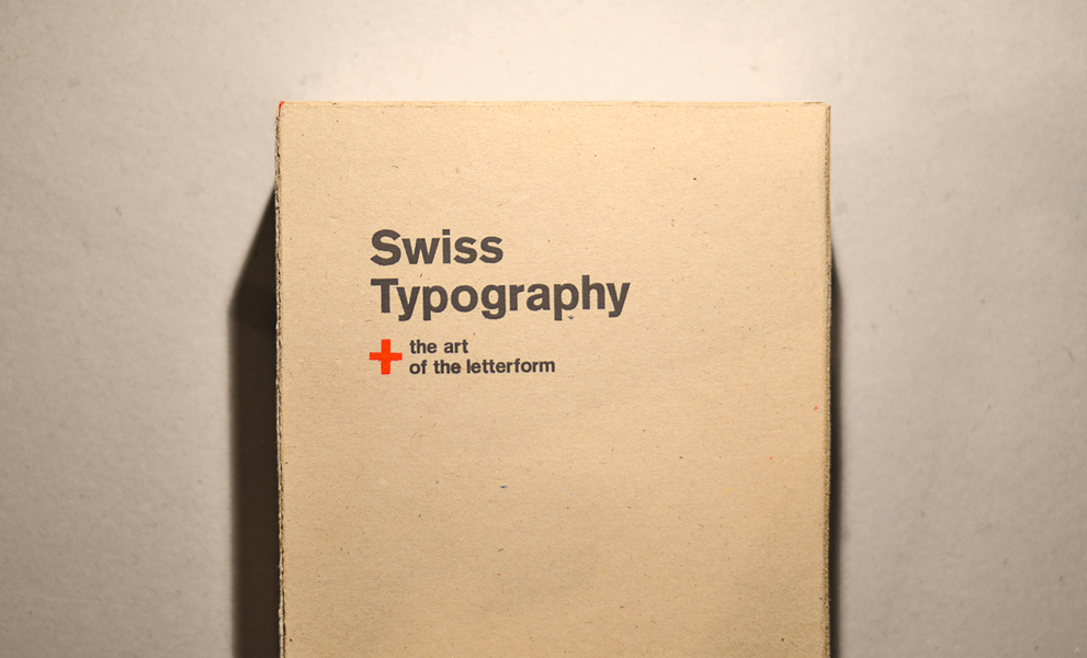
That same screen print on the display box, which was made of the same board as the cover of the catalogue.

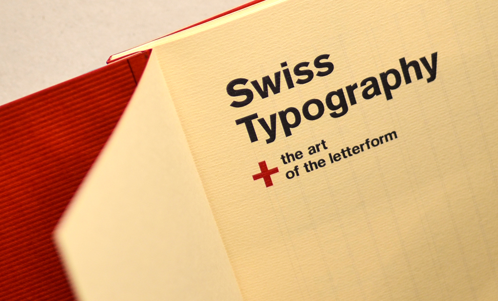
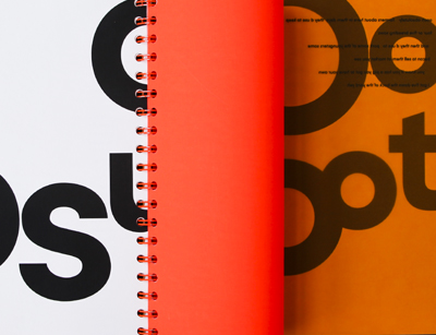
The endpapers were simply textured red card. The type is set in Akzidenz Grotesk, except for the chapter on Helvetica, which is set in Helvetica (duh).

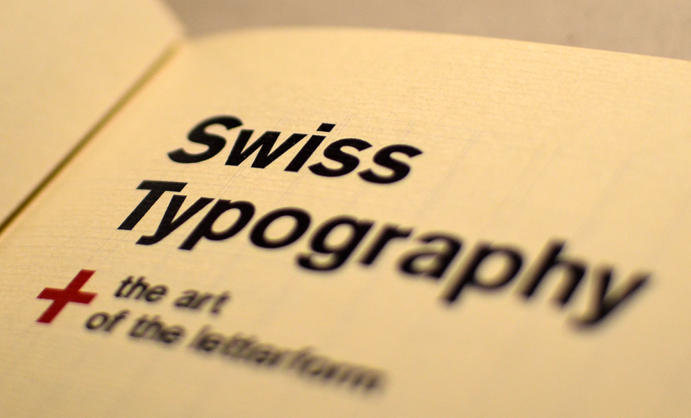
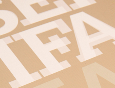
The grid is visible throughout the catalogue, and layouts sticks rigidly to it.

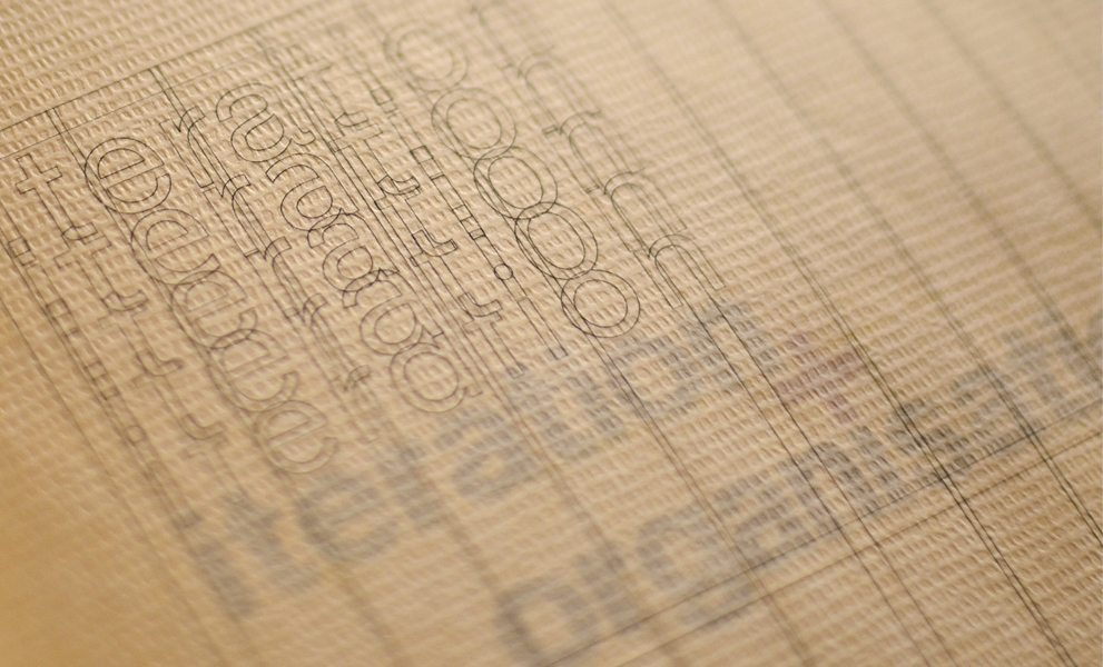
For chapter openings, I used semi transparent sheets which typographically explained the contents (ie. this chapter is on ‘iteration + organisation’).

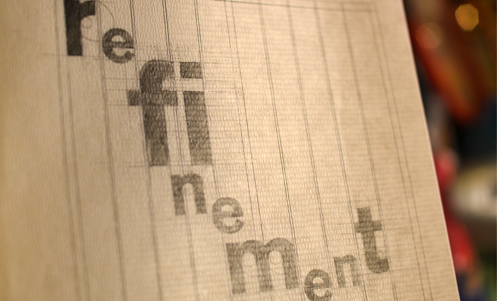
Another chapter opening, this one was all about ‘refinement’.

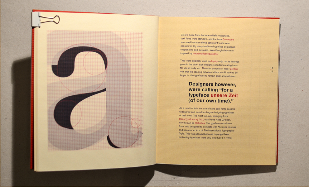
An illustration made layering Times New Roman and Helvetica, for a chapter on the transition from serif to sans serif typography.

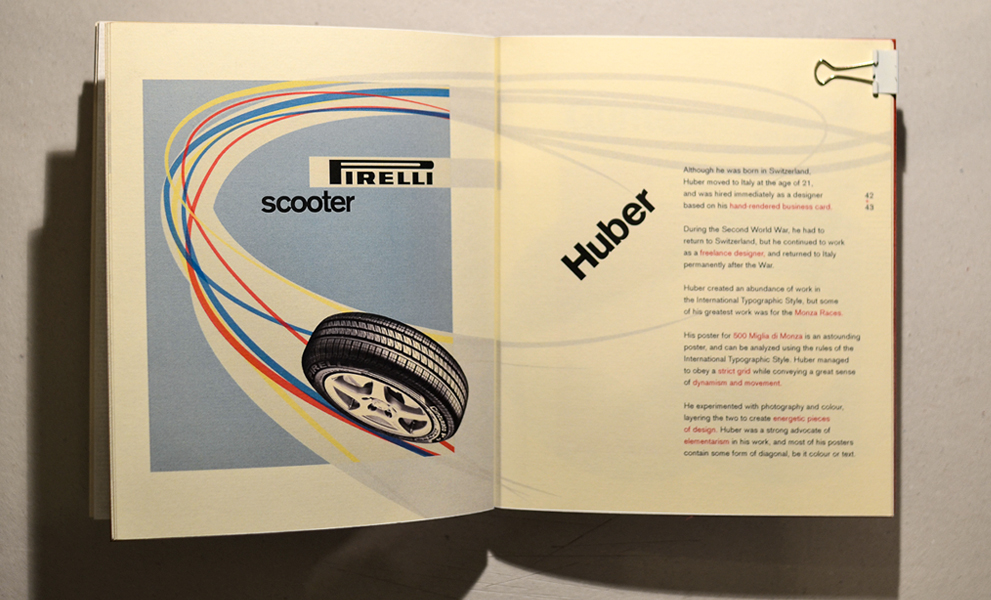
For the chapter on ‘perfection’, I recreated canonical designers’ work (above: Max Huber), while trying to imagine what goes on behind the grid.

More Projects