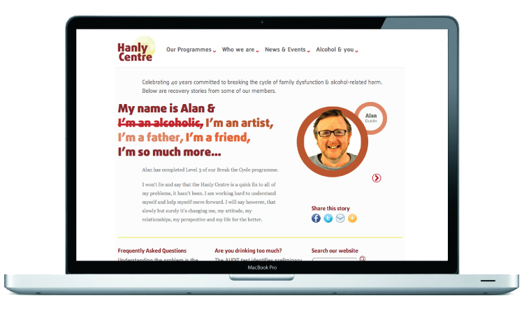
Hanly Centre homepage, featuring a ‘stories slider’ which presents users with a member of the Hanly Centre, and their story of recovery.
The site had a great deal of content, which needed to be categorised and presented in a simpler, friendlier format.
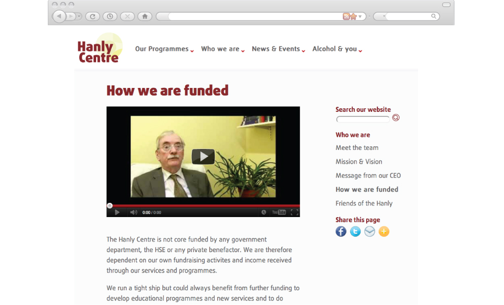
There were several video pages where the CEO of the Hanly Centre spoke about services offered.
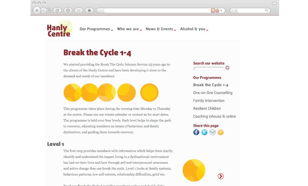
The Hanly Centre has a number of programmes, to cater for the vast range of recovering members. I developed different identities for each programme.
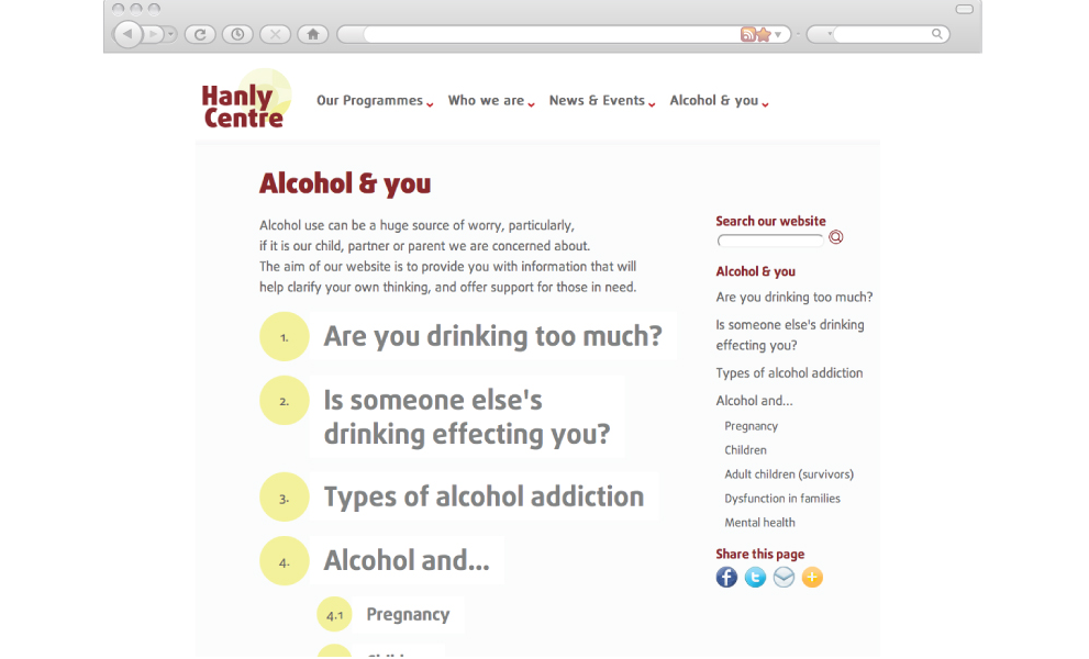
The site contained a lot of text-heavy pages, including educational essays on alcoholism and recovery.