I began by cutting out letters and laying them on top of each other. I scrapped this in the end, but it familiarised me with the subtleties of the letterforms.

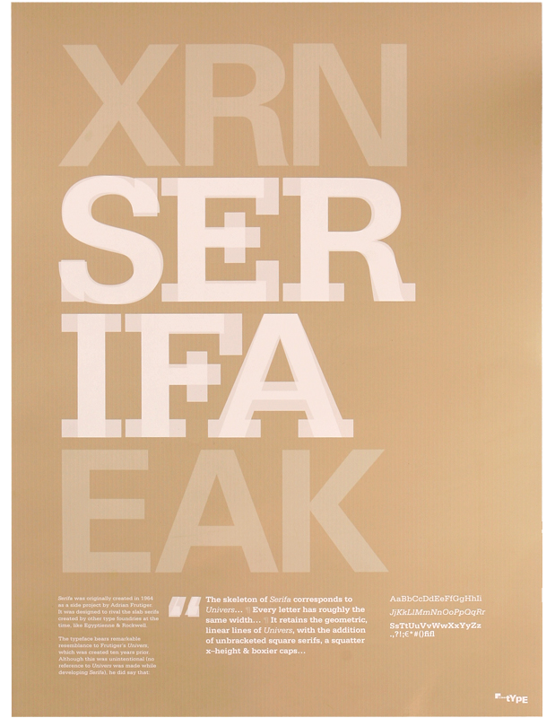
Couldn’t help trying out the very obvious ‘skeleton’ idea.

I layered each letter of Serifa on top of each letter of Univers, and funny enough, the most interesting combinations happened to be ‘S’, ‘E’, ‘R’, ‘I’, ‘F’ and ‘A’.
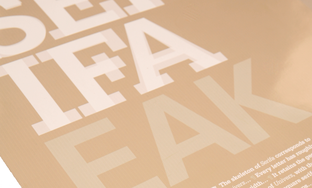
Some delicate typesetting and the poster was finished. The gloss stock gave it some shine, which allowed the whites to pop.