The International Society for Quality in Healthcare

How could a logo represent a future-focused organisation, without neglecting its traditional qualities? The International Society for Quality in Healthcare (ISQua) has been setting the standards for quality in healthcare for more than twenty years, but their identity was stale and needed to be modernised to reflect their contemporary principles.

ISQua operates three websites and produces a huge amount of reports, as well as the ISQua Journal. I needed to make a simple mark that worked across various platforms. I drew a simple typographic mark, using ticks and line charts as my sources. I used Rotis Semi Sans as a reference for the logotype, as it’s slight serifs hint towards heritage, but the letterforms remain contemporary.

I also redesigned each of ISQua’s websites, a set of stationery and their Journal for Quality in Healthcare.

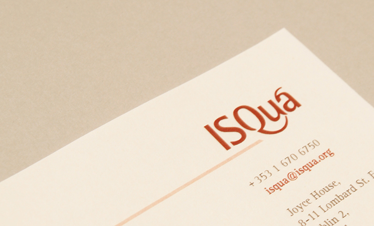
ISQua’s logo suggests positivity and represents “raising standards”.

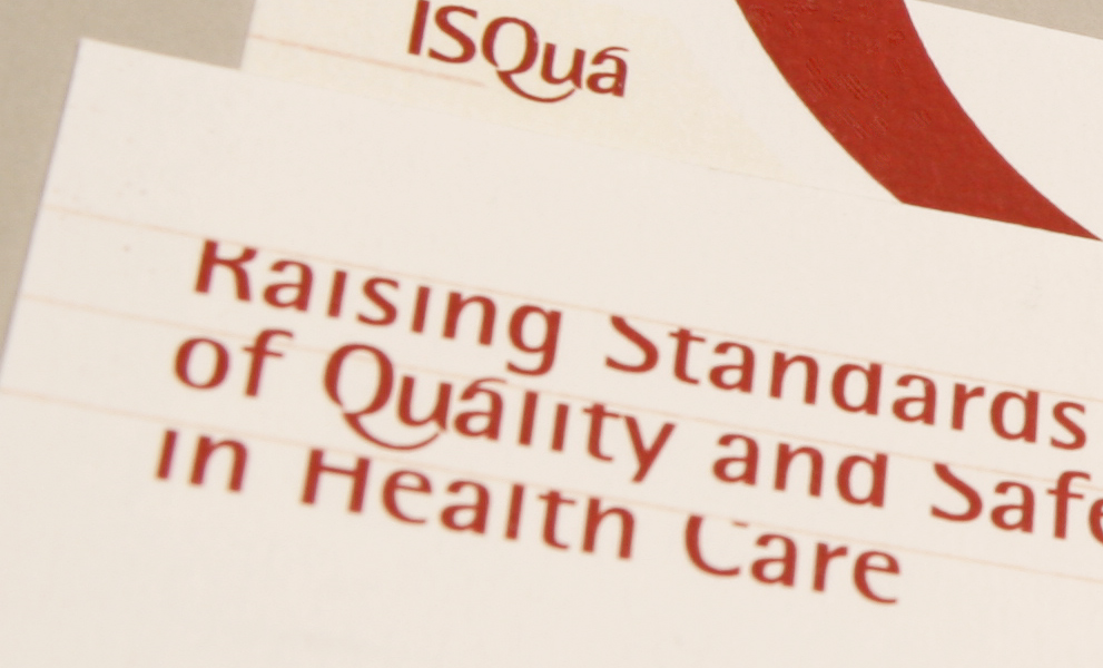
The business cards depicted ISQua’s dedication to raising standards of quality and safety in health care.

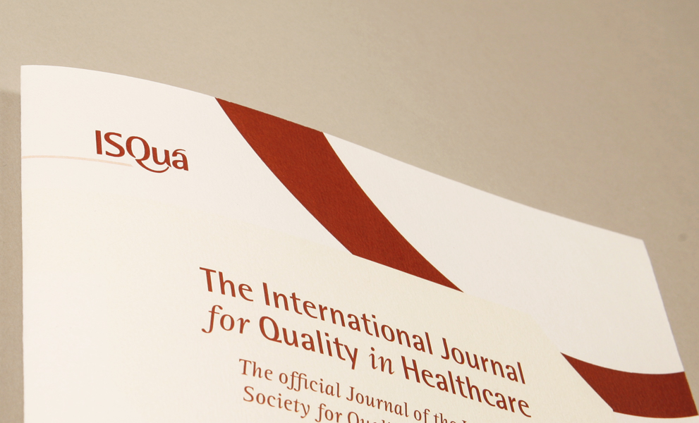
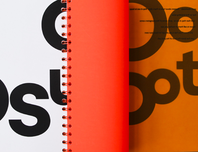
The ISQua Journal is produced annually and contains research and evaluation of health care services globally.

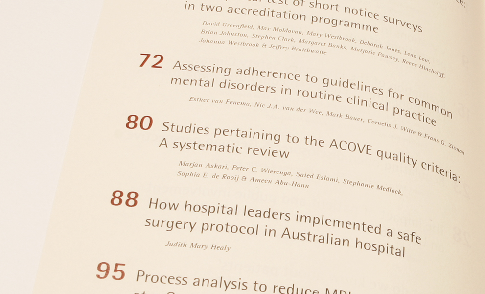
Detail of contents page of the ISQua Journal. Rotis Serif is used for textual content.

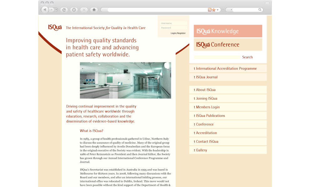
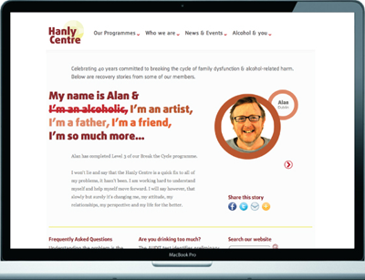
One of three ISQua websites I designed.

More Projects